
Our Map of the Month shows the impact of asphalt and concrete on city temperatures, and why we need to ‘de-pave’ and ‘re-plant’ in a warming climate
By Dr Thami Croeser, RMIT University, and Professor Michele Acuto, University of Melbourne
We’ve just lived through the world’s hottest year on record, as well as the hottest decade on record.
And yet, we keep building our cities out of materials that get incredibly hot during heatwaves – which also stay hot well into the night. For example, unshaded asphalt can reach temperatures of 75°C during a heatwave.

This is why cities experience the ‘urban heat island effect’ – a striking phenomenon which makes cities 4-10 degrees hotter than the countryside.
During a succession of recent heatwaves in Perth, the city experienced seven days above 40°C in February alone. At these temperatures, heat-related illnesses weigh on the economy and can be a deadly threat to vulnerable communities.
Energy demand goes through the roof, often crashing the grid and causing blackouts, while our streets become desolate.
So, what can cities do about heatwaves, and the urban heat island effect?
There’s lots of excellent research that tells us that a crucial part of the response is planting trees – and a lot of them. A recent study found that more than 40 per cent canopy cover is required just to negate the heating effects of asphalt and concrete.
If planting trees is like installing natural air-conditioning, then laying asphalt is like doing star jumps while wearing a thick woolly jumper.
Currently the world is doing both.
We’re planting trees and building whole new suburbs with vast expanses of unshaded asphalt, plus black, heat-absorbing roofs on our houses. The development of apartment buildings follows a similar pattern: inner city areas might be becoming more pedestrian friendly and ‘buzzy’, but our streets are mostly car-oriented, which means we keep all the asphalt and concrete.
With tree planting efforts barely keeping pace with tree losses, we’re going to want to not only up our urban forestry budgets, but also look at the other side of the equation: all that asphalt.
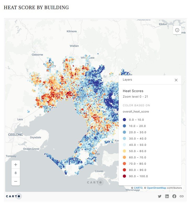
Our latest Map of the Month focuses on this issue. Using detailed data from Geoscape Australia, for every building in Metropolitan Melbourne, we’ve calculated the area around each structure that is made of asphalt and concrete.
We’ve the assigned a colour to each building to indicate whether it’s getting natural air-conditioning or wearing that metaphorical woolly jumper.
If your house is mostly surrounded by asphalt and concrete, it’ll show up as dark red. At the other end of the scale, if you’re lucky enough to be surrounded by trees and vegetation, you’ll see a lot of blue in your neighbourhood.
We also mapped neutral materials (grass and bare soil) and factored these into our scoring. Because we are looking at the impact of different kinds of open space around buildings, we haven’t included the heat impact of the buildings themselves, which can also add to the urban heat island effect.
The results are striking.
In total, we have surrounded our homes and workplaces with 271 square kilometres of asphalt and concrete, an area the size of central Paris and central Brussels put together.
More than half of all the buildings in Melbourne – over 1.5 million structures – are surrounded with land that’s at least a third concrete and asphalt.
The distribution of these ‘sweltering streets’ is very uneven too. New suburbs on the fringe and high-density inner neighbourhoods cop a lot of heavy asphalt cover just waiting to soak up heat.
Check out the difference between the post-industrial neighbourhoods of Abbotsford and Richmond in the City of Yarra – which took on over 5,000 new residents in 2023 – and the adjoining established low-rise residential areas with leafy lushness in Kew and Hawthorn.

There’s also a stark east-west divide, with Melbourne’s wealthy leafy suburbs enjoying much better protection than our hotter – and more socioeconomically disadvantaged – suburbs in the west.
From the established suburbs of Hobson’s bay to the western fringe at Werribee, and all the way north to Craigieburn, is a sea of red. That’s a lot of heat exposure, carried by a lot of people in lower-income, less flexible (and often outdoor) employment, with less ability to pay for air conditioning.
Fortunately, our rolling plains of hot asphalt don’t have to be permanent.

A global movement to ‘de-pave’ cities highlights the many ways that streets can be retrofitted to make space for green cover – often by taking a little space back from cars.
This ranges from small projects to remove parking spaces to widening footpaths and closing lanes to create urban parks.
Recent projects have shown how cities can narrow wide-splayed intersections to both discourage speeding and add new green space.
With millions of square metres of asphalt surrounding the places we live and work, we certainly have our work cut out for us, and de-paving is still a fairly marginal activity in most cities.
As cities like Paris, London and Barcelona lead the way in boldly re-balancing their relationship with the automobile, we see huge potential to turn Melbourne’s asphalt into thriving urban nature.
We want to see some of those red patches on our Map of the Month turn dark blue.
Map of the Month is a science communication project of the University of Melbourne (Melbourne Centre for Cities, AURIN, Melbourne Data Analytics Platform and Pursuit) using maps to spark important policy conversations across metropolitan Melbourne. This pilot is supported by the Lord Mayor’s Charitable Foundation and in partnership with the Victorian Office for Suburban Development and the Municipal Association of Victoria. Academics, community leaders and government representatives from across Melbourne contribute to the maps and accompanying stories.
This month’s story was a collaboration between RMIT’s Centre for Urban Research and the Melbourne Centre for Cities, and the map was produced by Dr Emily Fitzgerald, Amanda Belton and Dr Stuart Lee, using data kindly provided by AURIN and Geoscape Australia.
This article was originally published on The Pursuit. Read it here.