
By Michael J. Ostwald & The Conversation Digital Storytelling Team

Dr. Michael J. Ostwald is Scientia Professor of Architectural Analytics at the University of New South Wales (UNSW), Sydney (Australia) where he was previously Associate Dean of Research in the Faculty of Arts, Design and Architecture and in the Faculty of the Built Environment. He is an adjunct Professor at XJTLU (China) and University of Liverpool (UK) and has consistently been ranked 'top 10' in the world in architecture (Stanford 2019-2024) and 'a top 2%' globally cited researcher in all fields (Stanford 2019-2024) .
If you asked someone on the street to name Australia’s favourite building, there's a good chance it would be the Sydney Opera House.
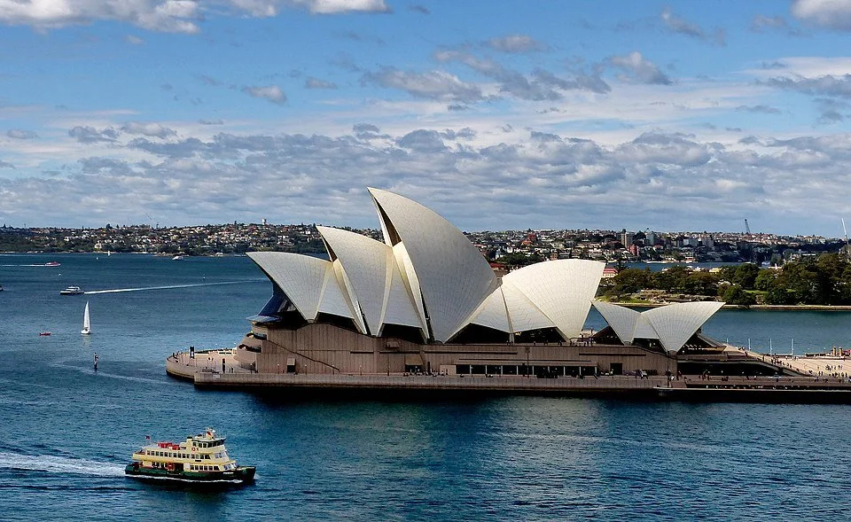
Sydney Opera House was opened 1973. Bernard Spragg / Wikimedia
But this iconic structure hasn't always been considered one of the country's most beautiful buildings. In the 1960s, it was described as an ugly “monstrosity” that looked like a “disintegrating circus tent”.
This dramatic shift in attitude raises two questions about our experience of the built environment.
How do we make decisions about what is beautiful?
And why do we then change our minds?
Answers to these questions can be found in psychology and neuroscience.
The science of attraction
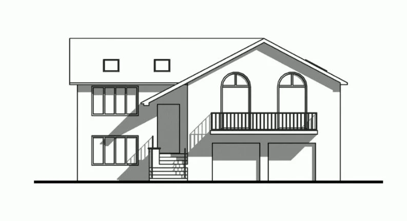
This is what we'd call a standard suburban home. Notice where your eyes drift first.
In the late 19th century, scientists realised there are patterns in the ways people respond, emotionally and intuitively, to what they see.
More recently, studies have identified several qualities of objects that attract the eye and hold its gaze, triggering pleasurable spikes in brain activity, making the heart beat faster and the skin tingle.

Here, we tracked the eye movements of people looking at that standard suburban home. The eye is drawn to the complex features like the balcony and arched windows, or the centre like the door and steps.
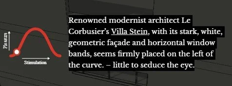
One of the simplest models for explaining this aesthetic attraction was developed in the 1960s by psychologist Daniel Berlyne.
Berlyne’s model of aesthetic appreciation is typically represented by a bell-shaped curve on a graph.

The horizontal axis (‘arousal potential’) depicts the volume of stimulation we experience when viewing something.
It ranges from bland or repetitive objects on the left to complex and unexpected ones on the right.

Bland and repetitive
Complex and unexpected
The vertical axis of the graph (‘hedonic value’) is the amount of pleasure we feel when viewing something. This scale rises from unappealing at the bottom to attractive at the top.
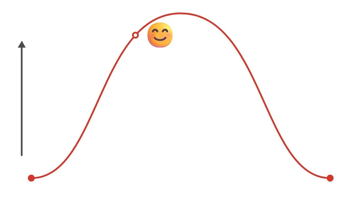
This model suggests that we are most likely to perceive something as beautiful if it is neither too simple nor too complex, and not too dull or too surprising.
We find beauty, science tells us, in the balance of these properties. This is also why, if we become more familiar with an object (like the Sydney Opera House), we may reassess our initial judgements.
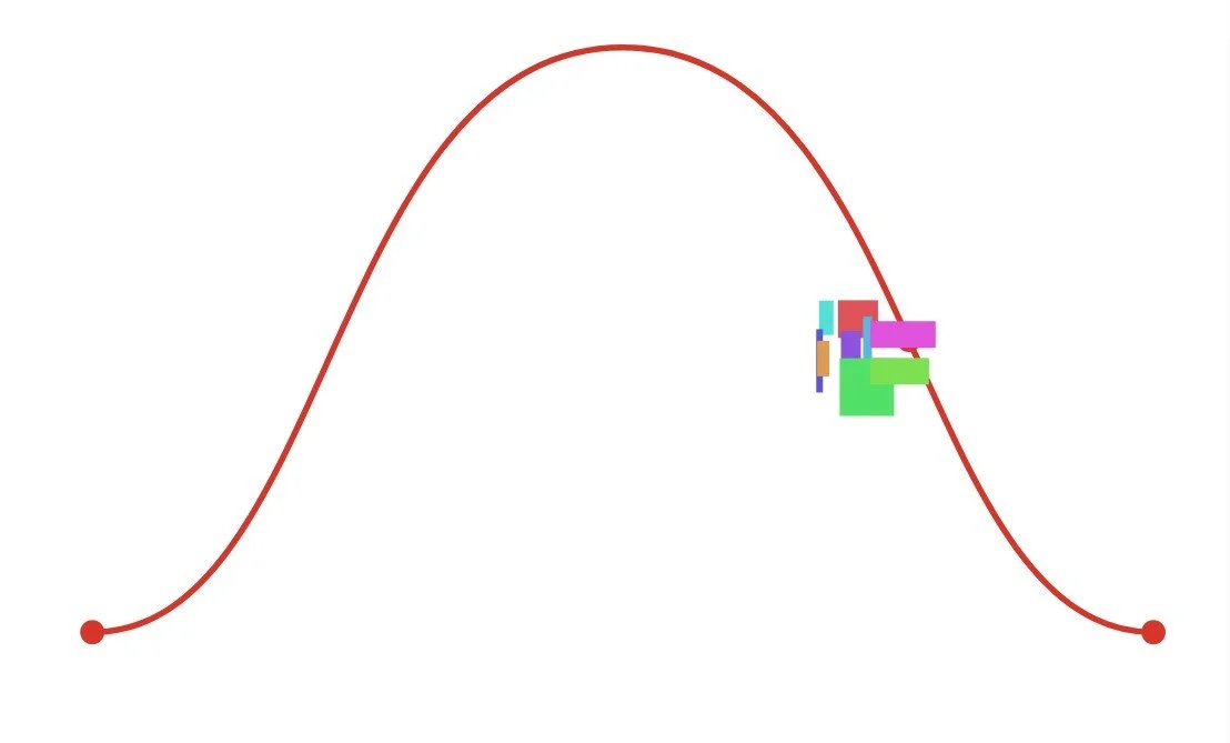
Let's look at some famous buildings and place them on Berlyne's curve. We can apply the principles of pleasure, stimulation and beauty and see how these architects stack up.
Villa Stein, France - Le Corbusier


Robie House, USA - Frank Lloyd Wright


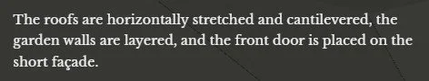

Gunther House, USA - Frank Gehry


In the 1960s, viewing the Sydney Opera house for the first time may have triggered the 'shock of the new'.
The building would have seemed both complex and alien.
But as the shock subsided, the Opera House's underlying geometric properties like symmetry and repetition at different scales would have cemented its present day, more central location on the curve.
Is there a remedy for ugliness?
If you asked someone on the street to name Australia’s ugliest building, they might single out the ‘McMansions’ multiplying at the edges of suburbia.
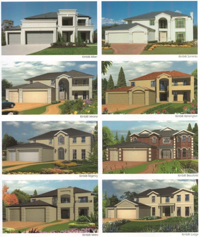
Clarendon Homes ‘Kirribilli’ Dwelling Façade Options. Peter McManus, UNSW
These project homes, almost never designed by architects, would be found to the left of centre in Berlyn’s curve. They are slightly dull and predictable, but not entirely in the ugly zone.
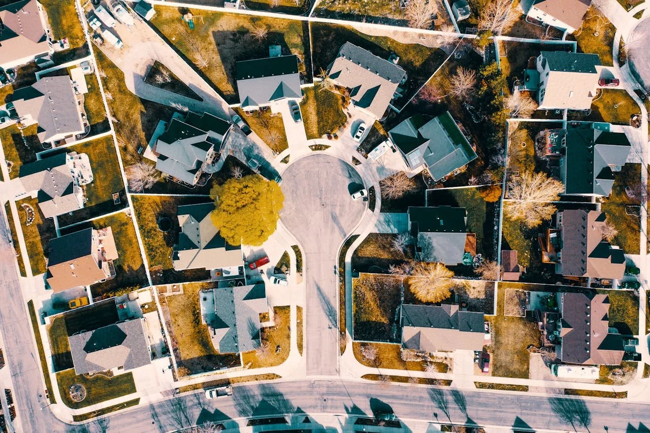
Large, suburban homes. Michael Tuszynski / Pexels
Here's the problem with suburbia: imagine if we took the world’s most beautiful house and then placed almost identical copies side by side on a street.
Next, push them so close together that there's only room for a dark concrete strip between them, no trees or shrubs.
Is the house still beautiful?
In isolation, it may be, especially for the euphoric homeowner who's simply happy to have a roof over their head. But the collective ugliness of the street, its monotonous and oppressive character, overwhelms any beauty that may exist.
The problem with suburban ugliness is that people who build and buy McMansions tend to prioritise the interior (marble benchtops, tick; butler's pantry, tick; ducted air conditioning, tick) and ignore the qualities of the street it is located on.

A typical Roman street features terraced apartment blocks with restaurants and shops on the street frontage. Rachel Claire / Pexels
The reverse occurs in many parts of Europe, where tree-lined boulevards shelter cafes on the ground level with apartments above. These buildings often have very simple repetitive shapes, but are finished with subtle variations in colour, texture and materials.
Here, beauty is found in the collective qualities of the street, not in the appearance of a single home.

A Spanish street. Photo: Anna S / Pexels
Many of Melbourne’s and Sydney’s most sought-after suburbs were once regarded as ugly.
Perhaps when the owners of houses in the new suburban sprawls gradually repaint their homes, remodel their facades, replace old cladding, reject black roofs, plant trees and celebrate diversity in their neighbourhoods, suburbia may swing just slightly closer to the peak of Berlyne's curve.
This article has been republished from The Conversation under Creative Commons license. Read the original.